What I like the most about SwiftUI is the ability to perform more tasks with less code. We can literally design a whole screen in no time. Thanks to SwiftUI modifiers, all the attributes are quickly accessible and the whole code is easily readable – Leaving all the AutoLayout constraints heavy lifting to the system.
In a previous article, we built a horizontal paging UIScrollView with Auto Layout. In this article, we are going to build a similar feature leveraging the magic of SwiftUI.
Along the way, we will get to use many UI components like ZStack, HStack and ScrollView.
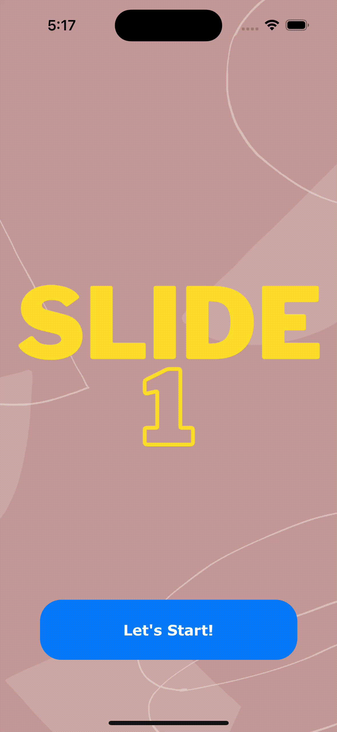
The final result will look like this:
Setup the project
Create a new Xcode project using the App template, and make sure the Interface type is set to SwiftUI.
Also, you can download the images that we will use along the way in this article and add them on your project assets.
Once the project is set up, you will notice there is already two files in the Project navigator: [YouProjectName]App.swift and ContentView.swift.
The first file is your app scene and points to the main screen implemented in the ContentView.swift file.
In this article, all our work will be done inside this file which represents our main screen – The onboarding slideshow 🙂
Select the ContentView.swift file and remove the default implementation of the body. This will throw an error because it is not supposed to be empty, but we will fix this in a bit.
var body: some View {
}
Our final slideshow has the following features:
- It should scroll horizontally.
- The button should be sticky, in other words, it shouldn’t scroll with the rest of the content.
- Each image should fill the entire screen.
- Paging is enabled so the scroll view stops on multiples of the scroll view’s bounds when the user scrolls.
Set the images
The images are part of a ScrollView that embed a horizontal stack. The body implementation is now as below:
ScrollView(.horizontal) {
        HStack {

     }
}
As you may guess it, the images will be put inside the HStack:
GeometryReader { geometry in
    ScrollView(.horizontal) {
          HStack {
              Image("Slide1")
                  .resizable()
                  .aspectRatio(contentMode: .fill)
                  .frame(width: geometry.size.width)
                  .clipped()
          }
    }
}
The code above will fill the screen with an image. The image will be part of a horizontal stack along with the other images that we will be adding in a bit. The horizontal stack is mandatory because it will allow to arrange its subviews (the images in this case) in a horizontal line.
We embedded all the content in a GeometryReader container view, this way we can leverage the parent’s frame and get the width on the fly to use it as the width of the image.
We used other modifiers like the .clipped modifier to ensure the image is clipped to its parent view.
Time to add the other slides. The same way we added the first one:
GeometryReader { geometry in
    ScrollView(.horizontal) {
        HStack {
            Image("Slide1")
                .resizable()
                .aspectRatio(contentMode: .fill)
                .frame(width: geometry.size.width)
                .clipped()
            Image("Slide2")
                .resizable()
                .aspectRatio(contentMode: .fill)
                .frame(width: geometry.size.width)
                .clipped()
            Image("Slide3")
                .resizable()
                .aspectRatio(contentMode: .fill)
                .frame(width: geometry.size.width)
                .clipped()
            Image("Slide4")
                 .resizable()
                 .aspectRatio(contentMode: .fill)
                 .frame(width: geometry.size.width)
                 .clipped()
        }
    }
}
That’s cool, however the Image blocks are duplicated, it would be better to have the view extracted. The view can have the image name and the width as dependencies since this is the only two informations our Image will need to draw.
private struct Slide: View {
    private let name: String
    private let width: CGFloat
    init(name: String, width: CGFloat) {
        self.name = name
        self.width = width
    }
    var body: some View {
        Image(name)
            .resizable()
            .aspectRatio(contentMode: .fill)
            .frame(width: width)
            .clipped()
    }
}
Doing this, we can refactor our previous code to something like this:
GeometryReader { geometry in
    let width = geometry.size.width
    ScrollView(.horizontal) {
        HStack {
            Slide(name: "Slide1", width: width)
            Slide(name: "Slide2", width: width)
            Slide(name: "Slide3", width: width)
            Slide(name: "Slide4", width: width)
        }
    }
}
Less code is always good 😅
Run the app, we have a sliding images like this:
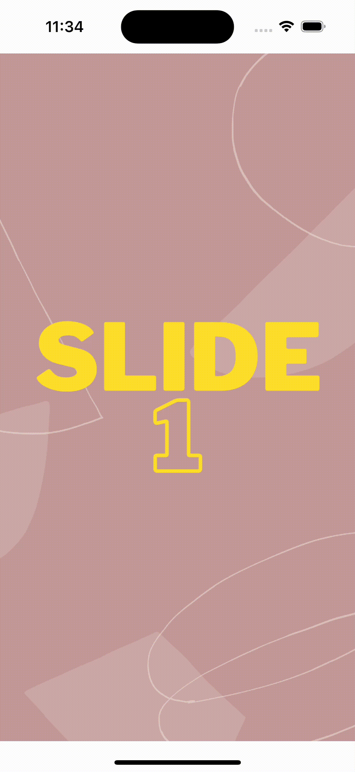
We can notice three cons about the above slide:
- The safe area leaves an ugly white space at the top and the bottom of the screen images.
- There is a white space between each image.
- The images are sliding without paging.
Let’s change the code above and add the missing modifiers to correct this behavior:
GeometryReader { geometry in
   let width = geometry.size.width
   ScrollView(.horizontal) {
     HStack(spacing: 0) {
            Slide(name: "Slide1", width: width)
            Slide(name: "Slide2", width: width)
            Slide(name: "Slide3", width: width)
            Slide(name: "Slide4", width: width)
     }
  }
  .ignoresSafeArea()
  .onAppear {
        UIScrollView.appearance().isPagingEnabled = true
   }
}
As you can see, we added the .ignoresSafeArea() modifier so the images can fill the entire screen bounds. Also, we specified a spacing on the horizontal stack of 0 to remove the white space between the images. Last but not least, we enabled paging on the ScrollView.
With the above modifications, we now have a pretty looking slideshow.

Overlay the slides with a sticky button
As a last part, we need to add a call-to-action button that will appear in a fixed position and will overlay the sliding images.
To do that, we can leverage the ZStack view which easily overlays its subviews.
Let’s start by embedding the button and the scroll view in a ZStack:
GeometryReader { geometry in
    let width = geometry.size.width
    ZStack {
        ScrollView(.horizontal) {
            HStack(spacing: 0) {
                Slide(name: "Slide1", width: width)
                Slide(name: "Slide2", width: width)
                Slide(name: "Slide3", width: width)
                Slide(name: "Slide4", width: width)
            }
        }
        .ignoresSafeArea()
        .onAppear {
            UIScrollView.appearance().isPagingEnabled = true
        }
        Button("Let's Start!", action: onClickAction)
            .frame(width: 300.0, height: 70.0)
            .background(Color.blue)
            .cornerRadius(25)
            .foregroundColor(.white)
            .font(.custom("Verdana", size: 17.0).bold())
    }
}
Also, we will need to add the onCLickAction method that is going to be called on the button click:
private func onClickAction() {
// Move to home screen
}
Running the app gives us the following:

The button is overlaying the images, which is what we want. However the button position needs to be adjusted so it is placed at the bottom of the screen. In order to do that, we need to embed the button in a VStack and add a spacer above the button to push it to the bottom of the screen.
VStack {
       Spacer()
       Button("Let's Start!", action: onClickAction)
           .frame(width: 300.0, height: 70.0)
           .background(Color.blue)
           .cornerRadius(25)
           .foregroundColor(.white)
           .font(.custom("Verdana", size: 17.0).bold())
           .padding(.bottom, 50.0)
}
You may also notice that we added a .padding modifier towards the bottom of the screen to avoid the safe area. Feel free to adjust it to your needs 🙂
Run the app, now our gorgeous slideshow will look as expected.

That’s it for this SlideShow article, I hope it can help you implement your own app onboarding experience 🙂
In upcoming articles, I will write about other SwiftUI animations and APIs – So stay tuned 🚀
Thanks!