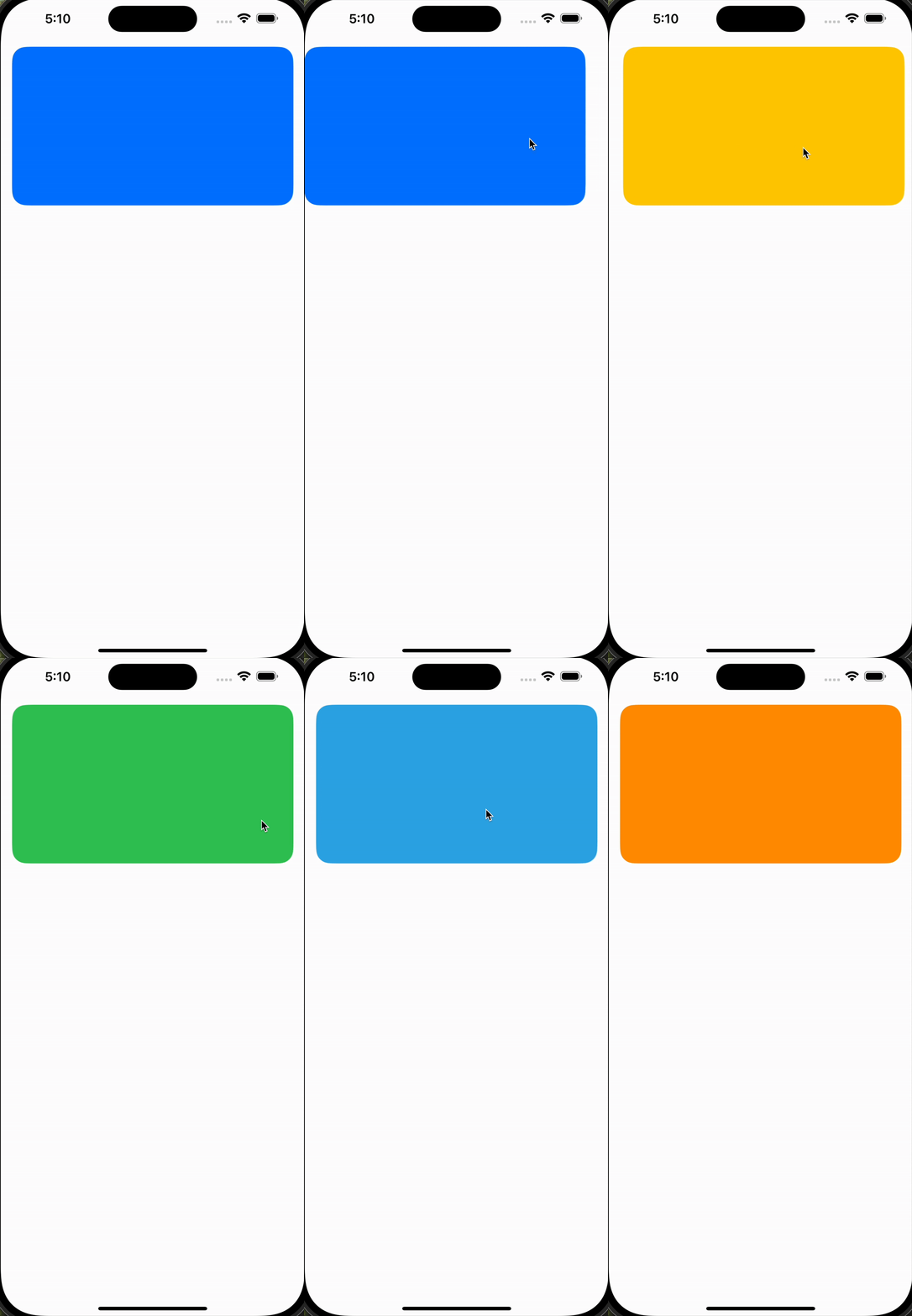
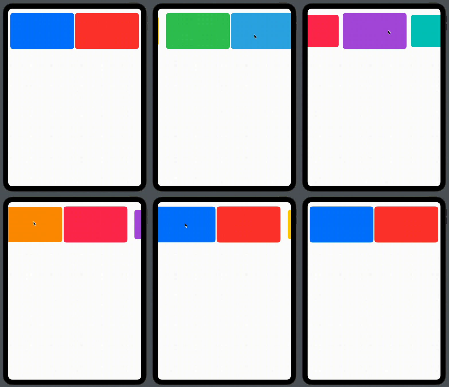
In this article, you will learn how easy it is to add fancy custom animations to your views, you will implement a simple gallery using SwiftUI‘s ScrollView and spice it up with the help of some view modifiers.
At the end of this article, this is what the end result will appear as

Without further ado, let’s dive right in
Setup an Xcode project and make the following changes to ContentView.swift:
private var colors: [Color] = [.blue, .red, .yellow, .green, .cyan, .orange, .pink, .purple, .mint]

var body: some View {
   ScrollView(.horizontal) {
       HStack {
           ForEach(colors, id: \.self) { color in
               Slide(color: color)
          }
       }
   }
}
For the sake of this article, you just fill the slides with colors and arrange them horizontally in a HStack, which in turns embed inside a horizontally scrolling ScrollView.
Create a new swift file Slide.swift and make the following changes:
struct Slide: View {
    var color: Color
    var body: some View {
        Rectangle()
            .fill(color)
    }
}

#Preview {
    Slide(color: .red)
}
So far, the views will look horizontally arranged in the HStack.

Time to give ‘em the right frames 🙂
Switch to Slide.swift, so far the rectangle is filling the entire screen, update the code to the following to change its size and apply a radius corner to it:
 Rectangle()
    .fill(color)
    .aspectRatio(16.0 / 9.0, contentMode: .fit)
    .cornerRadius(20)
Doing that, the rectangle will get resized to fit within the available space while preserving an aspect ratio of 16:9.

Next, add the following modifiers to the Rectangle:
 .containerRelativeFrame(
      .horizontal,
      count: sizeClass == .regular ? 2 : 1,
      spacing: 10.0
  )
The code above will force the rectangle slide to resize when the container frame changes. In this case, when the width of the screen changes, the rectangle slide will adapt in size. We will see this in action when we render the preview for wide-screen devices.
Also, notice that we conditionally set how many views we want to fill the container’s visible frame at once. For iPhone screens, we want it to display one view at a time, while for wide screens, we want to display two views.
At the environment property for the size class:
@Environment(\.horizontalSizeClass) private var sizeClass
Next, add the transition animation to perform when scrolling the views:
.scrollTransition(axis: .horizontal) { content, phase in
      content
          .scaleEffect(
              x: phase.isIdentity ? 1 : 0.8,
              y: phase.isIdentity ? 1 : 0.8
          )
  }
This modifier callback is called each time the scroll event occurs. At that time, we check if the slide view is in the visible region of the screen (also known as the identity phase). If it is, we apply a scale effect to slightly decrease its size so that the visual focus remains on the slide view that is in its identity phase.
Here is the final code for Slide.swift:
struct Slide: View {
    @Environment(\.horizontalSizeClass) private var sizeClass
    var color: Color
    var body: some View {
        Rectangle()
            .foregroundStyle(color)
            .aspectRatio(16.0 / 9.0, contentMode: .fit)
            .cornerRadius(20)
            .containerRelativeFrame(
                .horizontal,
                count: sizeClass == .regular ? 2 : 1,
                spacing: 10.0
            )
            .scrollTransition(axis: .horizontal) { content, phase in
                content
                    .scaleEffect(
                        x: phase.isIdentity ? 1 : 0.8,
                        y: phase.isIdentity ? 1 : 0.8
                    )
            }
    }
}
So far the scrolling animation transition is implemented, to see it, switch back to ContentView.swift and wait for the preview reload.

The scroll view is scrolling as expected, but it is still touching the edges of the screen, also, the scrolling indicator appearing at the bottom is kind of useless – Let’s fix that 🙂
Add the following modifiers to the ScrollView in ContentView.swift:
.safeAreaPadding(.horizontal) //1
.contentMargins(.vertical, 10, for: .scrollContent) //2
.scrollTargetBehavior(.viewAligned) //3
.scrollIndicators(.hidden) //4
Spacer()
Let’s breakdown the above code:
//1: This will add some insets into the safe area of the scroll view so it doesn’t touch the edges of the screen.
//2: This will automatically inset the content of the scroll view by the safe area plus an additional 10 points on the top and bottom edges.
3//: Sets the scroll behavior of views scrollable horizontally, this modifier will allow to control the speed of scrolling using the deceleration rate. In our case, scrolling will behave at a reasonable speed so that we get a smooth transition between slides.
4//: Hide the scrolling indicator.
5//: Move the scroll view to the top of the screen.
Next, let’s modify the behavior of HStack by adding the following scrollTargetLayout() modifier.
HStack {
     ForEach(colors, id: \.self) { color in
         Slide(color: color)
    }
 }
 .scrollTargetLayout()
Since the HStack is embedded in a ScrollView, adding the .scrollTargetLayout modifier to the HStack helps manage how the views are laid out and how they respond to scrolling gestures. You should notice the difference in scrolling once you add this modifier.
Here is the final code of the ContentView.swift:
struct ContentView: View {
    private var colors: [Color] = [.blue, .red, .yellow, .green, .cyan, .orange, .pink, .purple, .mint]

    var body: some View {
       ScrollView(.horizontal) {
           HStack {
               ForEach(colors, id: \.self) { color in
                   Slide(color: color)
              }
           }
           .scrollTargetLayout()
       }
       .safeAreaPadding(.horizontal)
       .contentMargins(.vertical, 10, for: .scrollContent)
       .scrollTargetBehavior(.viewAligned)
       .scrollIndicators(.hidden)
        Spacer()
    }
}
That’s it, enjoy the slide show 🙂


References:
– WWDC23: Beyond scroll view.
– SwiftUI scrollTransition.
– Design A SwiftUI Onboarding Slideshow For Your App With ScrollView
Thanks for reading – see you in the next digest!
Discover more from SweetTutos
Subscribe to get the latest posts sent to your email.