MarkupKit is a framework for simplifying development of native iOS applications. It allows developers to construct user interfaces declaratively using a human-readable markup language rather than visually using Interface Builder, similar to how applications are built for Android and .NET.
For example, the following markup creates an instance of UILabel and sets the value of its text property to “Hello, World!”:
The output produced by this markup is identical to the output of the following Swift code:
let label = UILabel()
label.text = "Hello, World!"
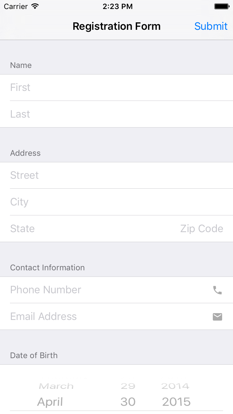
This tutorial introduces the MarkupKit framework by demonstrating how to create the following registration form using markup:
It highlights several of MarkupKit’s key features including:
- Static table views
- Custom table view cells
- Template properties
- Localization
- Autolayout
The code examples are written in Swift. Xcode 7.3 and iOS 8 or later are required.
Get MarkupKit
MarkupKit is developed as a freely available open-source project on GitHub. Begin by downloading the latest release here.
The file named MarkupKit.framework.tar.gz contains the framework bundle, MarkupKit.framework. Download this archive and expand it somewhere on your local system.
Create the Xcode Project
In Xcode, select File | New | Project to create a new iOS project. Select the iOS/Application/Single View Application template and click the “Next” button. Name the product “MarkupKitTutorial” and select Swift as the development language.
Add the MarkupKit framework to the project. Select File | Add Files to “MarkupKitTutorial”… and navigate to the location where you unzipped MarkupKit.framework. This will add the framework as a linked library. However, since MarkupKit is not a core iOS framework, it needs to be embedded in the application. To add MarkupKit as an embedded binary, do the following:
- Select the project root node in the Project Navigator view
- Select the “MarkupKitTutorial” target
- Select the “General” tab
- Delete MarkupKit.framework from the “Linked Frameworks and Libraries” section
- Drag MarkupKit.framework from the Project Navigator to the “Embedded Binaries” section
MarkupKit will now be bundled with the application.
Create the View Controller
In Project Navigator, select ViewController.swift. Import the MarkupKit module by adding the following line to the import section:
import MarkupKit
Modify the controller to extend UITableViewController instead of UIViewController and add the following loadView() override. This is the code that will actually load the view from the markup document we’ll be creating in the next section:
override func loadView() {
    // Load view from markup
    view = LMViewBuilder.viewWithName("ViewController", owner: self, root: nil)
}
Leave the automatically generated viewDidLoad() method as is for now, but remove the didReceiveMemoryWarning() method; it is not needed in this example.
Your view controller class should now look something like this:
import UIKit
import MarkupKit

class ViewController: UITableViewController {
    override func loadView() {
        // Load view from markup
        view = LMViewBuilder.viewWithName("ViewController", owner: self, root: nil)
    }

    override func viewDidLoad() {
        super.viewDidLoad()

        // ...
    }
}
Remove the Main Storyboard
Although MarkupKit can optionally be used in conjunction with storyboards, we will not be doing so in this example. Remove the main application storyboard that was automatically generated by Xcode:
- In Project Navigator, delete Main.storyboard
- Select the project root node
- Select the “MarkupKitTutorial” target
- Select the “General” tab
- Under “Deployment Info”, remove “Main” from the “Main Interface” field
Finally, update the application delegate to instantiate the view controller programmatically. Modify the automatically generated application:didFinishLaunchingWithOptions: method in AppDelegate.swift as follows:
func application(application: UIApplication, didFinishLaunchingWithOptions launchOptions: [NSObject: AnyObject]?) -> Bool {
    window = UIWindow()

    window!.rootViewController = UINavigationController(rootViewController: ViewController())

    window!.backgroundColor = UIColor.whiteColor()
    window!.frame = UIScreen.mainScreen().bounds

    window!.makeKeyAndVisible()

    return true
}
This will ensure that the view controller is presented at application startup. You can remove all of the other automatically generated methods; they are not used in this example.
Create the String Table
One of the things we will be demonstrating in this tutorial is MarkupKit’s support for localization. As a result, we’ll need a string table to store our localized content. Create the default string table by selecting File | New | File… from the menu, then selecting iOS/Resource/Strings File from the list of presented template options:
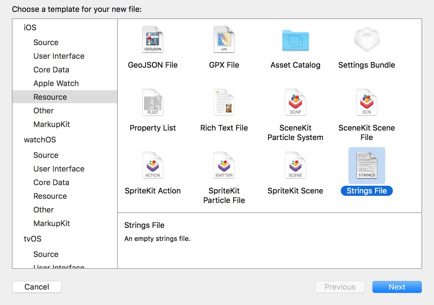
Name the file Localizable.strings. In the newly created file, add entries for the form title and “Submit” button text:
"title" = "Registration Form";
"submit" = "Submit";
We’ll use these values in the next section to localize the controller’s navigation bar content.
Create the Submit Button
Modify the controller’s viewDidLoad() method as follows to set the title and create the “Submit” button using the localized string values we created in the previous section:
override func viewDidLoad() {
    super.viewDidLoad()

    let mainBundle = NSBundle.mainBundle()

    // Set title
    title = mainBundle.localizedStringForKey("title", value: nil, table: nil)

    // Create "submit" button
    navigationItem.rightBarButtonItem = UIBarButtonItem(title: mainBundle.localizedStringForKey("submit", value: nil, table: nil),
        style: UIBarButtonItemStyle.Plain, target: self, action: #selector(ViewController.submitForm))
}
Note that we are associating an action named submitForm with the “Submit” button. This method will be invoked when the user taps the button. Create a stub implementation for this method now:
func submitForm() {
    // Display "form submitted" message
    let alertController = UIAlertController(title: "Status", message: "Form submitted.", preferredStyle: .Alert)

    alertController.addAction(UIAlertAction(title: "OK", style: .Default, handler:nil))

    presentViewController(alertController, animated: true, completion: nil)
}
We’ll come back to this method later once the form is complete.
Your view controller should now look something like this:
import UIKit
import MarkupKit

import UIKit
import MarkupKit

class ViewController: UIViewController {
    override func loadView() {
        // Load view from markup
        view = LMViewBuilder.viewWithName("ViewController", owner: self, root: nil)
    }

    override func viewDidLoad() {
        super.viewDidLoad()

        let mainBundle = NSBundle.mainBundle()

        // Set title
        title = mainBundle.localizedStringForKey("title", value: nil, table: nil)

        // Create "submit" button
        navigationItem.rightBarButtonItem = UIBarButtonItem(title: mainBundle.localizedStringForKey("submit", value: nil, table: nil),
            style: UIBarButtonItemStyle.Plain, target: self, action: #selector(ViewController.submitForm))
    }

    func submitForm() {
        // Display "form submitted" message
        let alertController = UIAlertController(title: "Status", message: "Form submitted.", preferredStyle: .Alert)

        alertController.addAction(UIAlertAction(title: "OK", style: .Default, handler:nil))

        presentViewController(alertController, animated: true, completion: nil)
    }
}
Create the View
Now we’re ready to create the markup document that will represent our view. Select File | New | File… from the menu. In the dialog that appears, select iOS/Other/Empty. Name the file ViewController.xml, ensure that the “MarkupKitTutorial” project target is selected, and click the “Create” button.
Add the following markup to the file you just created. It will serve as the starting point for the form we’ll be building over the next few sections:
The properties processing instruction (PI) is where we’ll be defining our “template properties”. Template properties are similar to CSS styles. They allow developers to abstract common property definitions into templates, which can then be applied by name to individual view instances. This makes it easy to assign common property values as well as modify properties later.
LMTableView is a MarkupKit-provided subclass of UITableView that facilitates the declaration of table view content. An LMTableView instance acts as its own data source and delegate, serving cells from a statically defined collection of sections and allowing it to be used as a general-purpose layout device. This particular table view will host all of the various fields we’ll be adding to our registration form over the course of the tutorial.
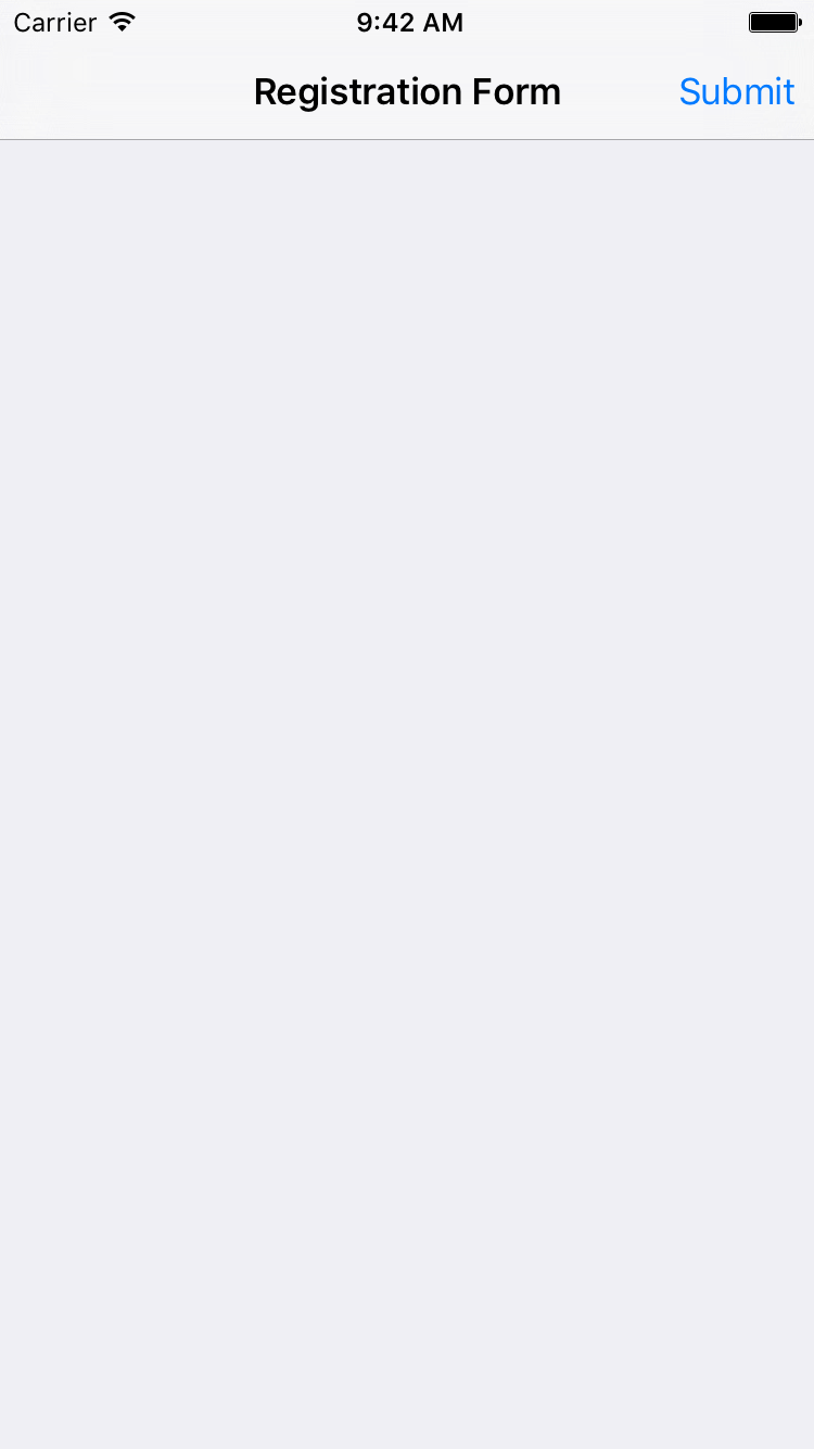
Build and Run the Application
Although it doesn’t do much yet, the application is now ready to run. Ensure that the “MarkupKitTutorial” scheme is selected in the scheme drop-down, and launch the application by selecting Product | Run from the menu or by clicking the “Run” button:
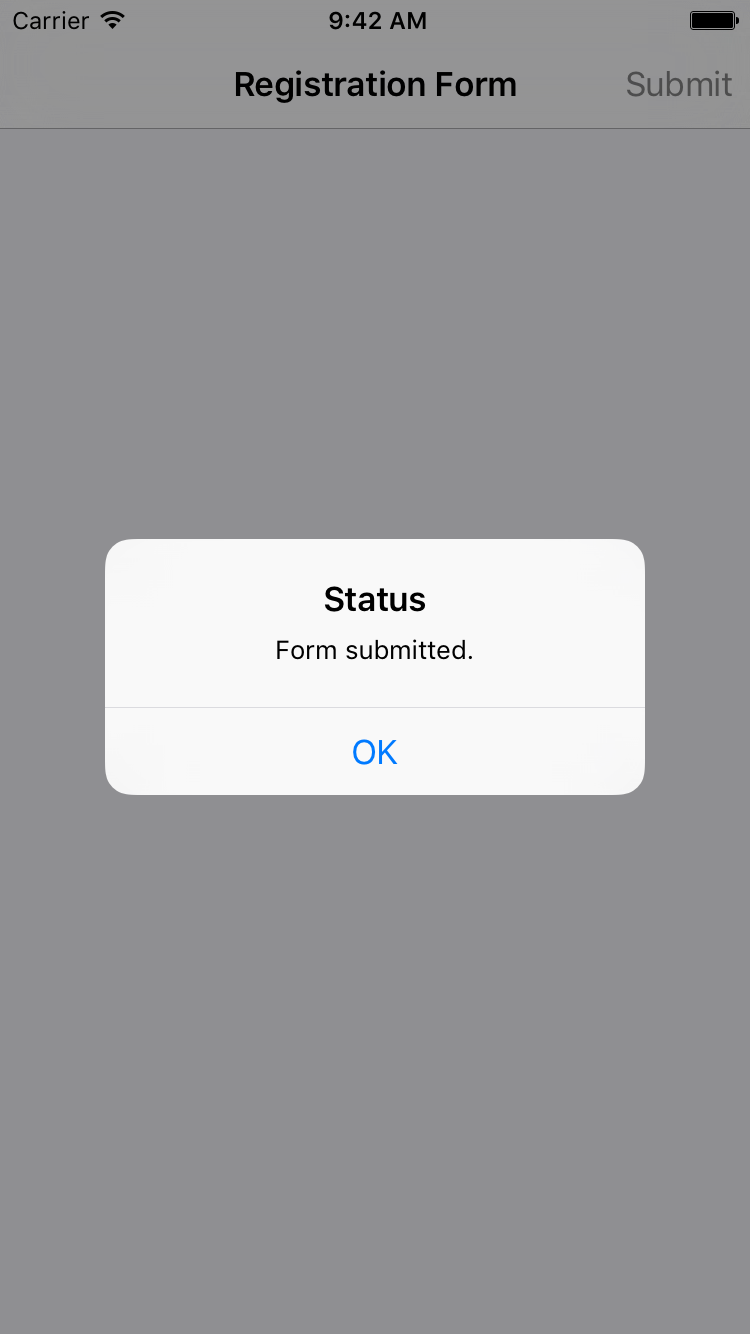
Tapping the “Submit” button displays the placeholder alert message we added earlier:
Create the Form Elements
Over the next few sections, we’ll be creating the form elements that we’ll use to collect the user’s registration data. As we add view elements to the markup document, we’ll also be adding corresponding outlets and actions to the controller class, similar to what we might do if we were creating the form using Interface Builder. However, since LMTableView will be handling all of the cell and layout management for us, our final controller class will be smaller and simpler than the Interface Builder version would be.
Name
First, we’ll create the text fields that we’ll use to collect the user’s first and last names. Add the following markup to the LMTableView element in ViewController.xml:
This markup declares two table view cells: one containing a text field representing the user’s first name, and a second for the user’s last name. Each cell is an instance of LMTableViewCell, a MarkupKit-provided subclass of UITableViewCell that facilitates the declaration of custom table view cell content. Cells are automatically sized to match the width of the table view and the intrinsic height of the content using autolayout. You guessed it right: No custom size or position calculations are required 😉
Property Templates
The “class” attribute is used to apply a property template to a view. It is similar to the “class” attribute in HTML, which associates a set of CSS style declarations with an HTML element. In this case, the attribute refers to the “formField” class, a property template that we’ll be applying to all of the form field cells in our table view.
Property templates are specified using JavaScript Object Notation (JSON). Each template is represented by a dictionary object defined at the top level of the JSON document. The dictionary’s key represents the name of the template, and its contents represent the property values that will be set when the template is applied.
Add the following JSON to the properties PI in ViewController.xml to create the “formField” class:
"formField": {
    "selectionStyle": "none"
}
When the markup is processed, the properties specified by the class will be applied to the table view cells. In this case, the template will set each cell’s “selectionStyle” property to “none”, ensuring that a tap on a cell does not show a highlighted state; since we’re using the cells to display input fields, we want the fields themselves to show a selected or focused state, not the underlying cells.
Outlets
The “id” attribute creates an outlet for a view declared in markup. Using key-value coding (KVC), MarkupKit “injects” the named view instance into the document’s owner (in this case, the view controller), allowing the application to interact with it.
The example markup defines two outlets: one for the first name text field and another for the last name field. Let’s add the outlets to our controller now. Enter the following declarations in ViewController.swift:
@IBOutlet var firstNameTextField: UITextField!
@IBOutlet var lastNameTextField: UITextField!
When the document is loaded, these outlets will be populated with the text field instances we declared in the markup document, just as if they had been defined in a storyboard or created programmatically.
Localization
Note that the values of the text fields’ “placeholder” attributes begin with an “@” symbol. When an attribute value begins with “@”, MarkupKit attempts to look up a localized version of the value before setting the associated property. The value of the attribute (minus the “@” prefix) represents the key that will be used to look up the value.
Add the following values to Localizable.strings so that the text fields’ placeholder properties will be properly localized when the document is loaded:
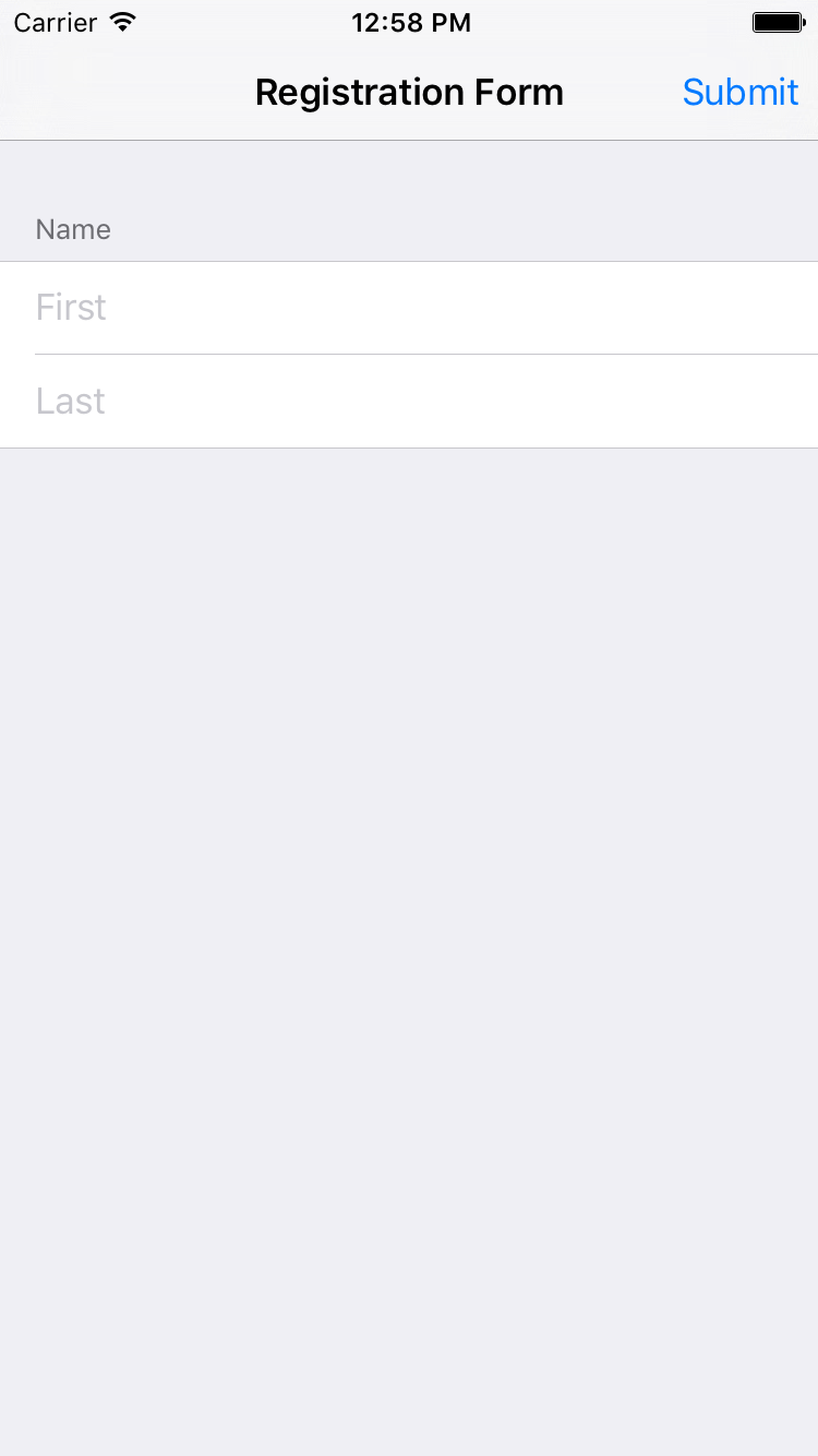
"first" = "First";
"last" = "Last";
Other Attributes
One additional attribute is used in this example to disable autocorrect, which is typically enabled by default. Setting the value of a text field’s “autocorrectionType” attribute to “no” is equivalent to programmatically setting the value of its autocorrectionType property to UITextAutocorrectionTypeNo, explicitly disabling autocorrect.
Section Header Views
Our final task for this section is to create the header view. Add the following markup to the table view immediately before the declaration of the first name cell:
The sectionHeaderView processing instruction corresponds to a call to the setView:forHeaderInSection: method of LMTableView, which associates a header view with a given section. The view element immediately following the PI is used as the header view for the current section.
In this case, the header view is an instance of UITableViewHeaderFooterView whose text label’s text property is set to the localized value associated with the “name” key. Add this value to Localizable.strings now:
"name" = "Name";
Build and Run the Application
At this point, ViewController.swift should look something like this:
import UIKit
import MarkupKit

class ViewController: UIViewController {
    @IBOutlet var firstNameTextField: UITextField!
    @IBOutlet var lastNameTextField: UITextField!

    override func loadView() {
        // Load view from markup
        view = LMViewBuilder.viewWithName("ViewController", owner: self, root: nil)
    }

    override func viewDidLoad() {
        super.viewDidLoad()

        let mainBundle = NSBundle.mainBundle()

        // Set title
        title = mainBundle.localizedStringForKey("title", value: nil, table: nil)

        // Create "submit" button
        navigationItem.rightBarButtonItem = UIBarButtonItem(title: mainBundle.localizedStringForKey("submit", value: nil, table: nil),
            style: UIBarButtonItemStyle.Plain, target: self, action: #selector(ViewController.submitForm))
    }

    func submitForm() {
        // Display "form submitted" message
        let alertController = UIAlertController(title: "Status", message: "Form submitted.", preferredStyle: .Alert)

        alertController.addAction(UIAlertAction(title: "OK", style: .Default, handler:nil))

        presentViewController(alertController, animated: true, completion: nil)
    }
}
ViewController.xml should look like this:
Finally, Localizable.strings should look something like this:
"title" = "Registration Form";
"submit" = "Submit";

"name" = "Name";
"first" = "First";
"last" = "Last";
Build and run the application. It should look something like this:
Address
Next, we’ll create the address section. Add the following markup to ViewController.xml, immediately after the last name cell declaration:
The sectionBreak processing instruction inserts a new section in a table view. It corresponds to a call to the insertSection: method of the LMTableView class (the first section is created implicitly when the table view itself is created).
Like the previous section, this section contains a header view and some text fields with localized placeholders. Add the localized values to Localizable.strings now:
"address" = "Address";
"street" = "Street";
"city" = "City";
Also add the new outlets to ViewController.swift:
@IBOutlet var streetTextField: UITextField!
@IBOutlet var cityTextField: UITextField!
Layout Views
Next, add the following markup below the city cell. The contents of this cell will be used to collect information about the user’s state and zip code:
Add the associated string values to Localizable.strings:
"state" = "State";
"zipCode" = "Zip Code";
Finally, add the outlets to ViewController.swift:
@IBOutlet var stateTextField: UITextField!
@IBOutlet var statePickerView: LMPickerView!
@IBOutlet var zipCodeTextField: UITextField!
Unlike the preceding examples, this cell doesn’t simply contain a single text field; it contains two fields, one representing the user’s state and another for the user’s zip code. Both fields are themselves contained in an instance of LMRowView, a MarkupKit-provided view class that automatically arranges its subviews in a horizontal line (kind of similar to LinearLayout in Android).
LMRowView is an example of a “layout view”, a class whose sole responsibility is managing the size and position of its subviews. Layout views allow developers to easily incorporate autolayout into iOS applications without needing to interact with layout constraints directly. Other layout views provided by MarkupKit include LMColumnView, which automatically arranges its subviews in a vertical line, and LMLayerView, which arranges its subviews in layers, like a stack of transparencies. These view classes can be combined to quickly and easily create sophisticated layouts.
View Weights
Note that each text field has a “weight” value associated with it. This value specifies the amount of excess space a view would like to be given within its superview and is relative to all other weights specified within the superview. For row views, weight applies to the excess horizontal space, and for column views to the excess vertical space.
In this case, the first text field has a weight of 2 and the second field a weight of 1. This means that the first view will be given 2 / (2 + 1), or two thirds of the available space in the row, and the second will be given 1 / (2 + 1), or one third of the available space.
Input Views
While the zip code field in the preceding markup is fairly straightforward, the state field has some additional content associated with it. The inputView processing instruction is used to associate an input view with a text field. It corresponds to the inputView property of the UITextField class:
...
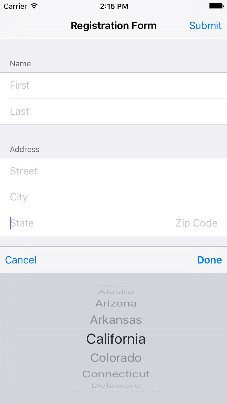
In this case, the input view is an instance of LMPickerView that will be used to present a list of U.S. states to the user. LMPickerView is a MarkupKit-provided subclass of UIPickerView that facilitates the declaration of picker view content. Like LMTableView, LMPickerView acts as its own data source and delegate, serving content from a statically-defined collection of row and component titles.
For example, the following markup could be used to create a picker view containing six rows representing the New England states. The “title” attribute represents the value that the user will see in the picker view. The “value” attribute is optional and is generally used to associate a system-level key or ID with a row. Replace the LMPickerView with “statePickerView” id with the following code:
However, while inline row declarations can be convenient for a small number of fixed options, they are not ideal for a larger number of options, such as the full U.S. state list. Instead, we’ll load the complete state list from a JSON document and populate the picker view programmatically.
To create the list, select File | New | File… from the menu and select iOS/Other/Empty in the dialog that appears. Name the file states.json and add the following values to it:
[
    {"name": "Alabama", "code": "AL"},
    {"name": "Alaska", "code": "AK"},
    {"name": "Arizona", "code": "AZ"},
    {"name": "Arkansas", "code": "AR"},
    {"name": "California", "code": "CA"},
    {"name": "Colorado", "code": "CO"},
    {"name": "Connecticut", "code": "CT"},
    {"name": "Delaware", "code": "DE"},
    {"name": "District of Columbia", "code": "DC"},
    {"name": "Florida", "code": "FL"},
    {"name": "Georgia", "code": "GA"},
    {"name": "Hawaii", "code": "HI"},
    {"name": "Idaho", "code": "ID"},
    {"name": "Illinois", "code": "IL"},
    {"name": "Indiana", "code": "IN"},
    {"name": "Iowa", "code": "IA"},
    {"name": "Kansa", "code": "KS"},
    {"name": "Kentucky", "code": "KY"},
    {"name": "Lousiana", "code": "LA"},
    {"name": "Maine", "code": "ME"},
    {"name": "Maryland", "code": "MD"},
    {"name": "Massachusetts", "code": "MA"},
    {"name": "Michigan", "code": "MI"},
    {"name": "Minnesota", "code": "MN"},
    {"name": "Mississippi", "code": "MS"},
    {"name": "Missouri", "code": "MO"},
    {"name": "Montana", "code": "MT"},
    {"name": "Nebraska", "code": "NE"},
    {"name": "Nevada", "code": "NV"},
    {"name": "New Hampshire", "code": "NH"},
    {"name": "New Jersey", "code": "NJ"},
    {"name": "New Mexico", "code": "NM"},
    {"name": "New York", "code": "NY"},
    {"name": "North Carolina", "code": "NC"},
    {"name": "North Dakota", "code": "ND"},
    {"name": "Ohio", "code": "OH"},
    {"name": "Oklahoma", "code": "OK"},
    {"name": "Oregon", "code": "OR"},
    {"name": "Pennsylvania", "code": "PA"},
    {"name": "Rhode Island", "code": "RI"},
    {"name": "South Carolina", "code": "SC"},
    {"name": "South Dakota", "code": "SD"},
    {"name": "Tennessee", "code": "TN"},
    {"name": "Texas", "code": "TX"},
    {"name": "Utah", "code": "UT"},
    {"name": "Vermont", "code": "VT"},
    {"name": "Virginia", "code": "VA"},
    {"name": "Washington", "code": "WA"},
    {"name": "West Virginia", "code": "WV"},
    {"name": "Wisconsin", "code": "WI"},
    {"name": "Wyoming", "code": "WY"}
]
Next, update ViewController.swift to populate the picker view by adding the following code to the controller’s viewDidLoad method:
// Load state data
let stateData = NSData(contentsOfFile: NSBundle.mainBundle().pathForResource("states", ofType: "json")!)
let states = (try! NSJSONSerialization.JSONObjectWithData(stateData!, options: NSJSONReadingOptions())) as! [[String: AnyObject]]

for state in states {
    statePickerView.insertRow(statePickerView.numberOfRowsInComponent(0), inComponent: 0,
        withTitle: state["name"] as! String, value: state["code"])
}
Now the complete list of U.S. states will be available to the user when the picker view is shown.
Accessory Views
The inputAccessoryView processing instruction is used to associate an input accessory view with a text field. It corresponds to the inputAccessoryView property of the UITextField class. An input accessory view is displayed immediately above the keyboard when it is visible on screen:
...
In this case, the accessory view is a toolbar containing “Cancel” and “Done” options. An action named “cancelStateEdit” is associated with the “Cancel” button, and an action named “updateStateText” is associated with the “Done” button. Add these actions to the view controller class now:
@IBAction func cancelStateEdit() {
    // Hide keyboard
    stateTextField.resignFirstResponder()
}

@IBAction func updateStateText() {
    // Update state text field and hide keyboard
    stateTextField.text = statePickerView.titleForRow(statePickerView.selectedRowInComponent(0), forComponent: 0)!
    stateTextField.resignFirstResponder()
}
Tapping the “Cancel” button will dismiss the picker view, and tapping “Done” will dismiss the picker and update the state text field to reflect the selected state value.
Other Attributes
Two additional attributes are used in the preceding example: “keyboardType” and “textAlignment”. Setting the value of a text field’s “keyboardType” attribute to “phonePad” is equivalent to setting the value of its keyboardType property to UIKeyboardTypePhonePad, ensuring that the field will display a keypad designed for entering telephone numbers. Specifying a value of “right” for a text field’s “textAlignment” attribute is equivalent to programmatically setting its textAlignment property to NSTextAlignmentRight, ensuring that the text field’s content will be right-aligned.
Build and Run the Application
Build and run the application. When the state field has the input focus, the picker view will be displayed, allowing the user to select a state from the list:
Contact Information
Next we’ll add fields for collecting contact information for the user including phone number and email address. Add the following markup to ViewController.xml immediately after the state cell:
Add the associated string values to Localizable.strings:
"contactInformation" = "Contact Information";
"phoneNumber" = "Phone Number";
"emailAddress" = "Email Address";
Add the outlets to ViewController.swift:
@IBOutlet var phoneNumberTextField: UITextField!
@IBOutlet var emailAddressTextField: UITextField!
The markup we just added creates two text fields with associated right views, as specified by the rightView processing instruction. The views are instances of UIImageView that present a hint to the user about the content expected by the field.
The image views refer to a property template named “hintIcon” that we will use to set the icons’ color. Add the following template to the properties PI, making sure that you add a comma after the previous template declaration (otherwise, it won’t be valid JSON):
"hintIcon": {
    "tintColor": "#aaaaaa"
}
Icon Image Sets
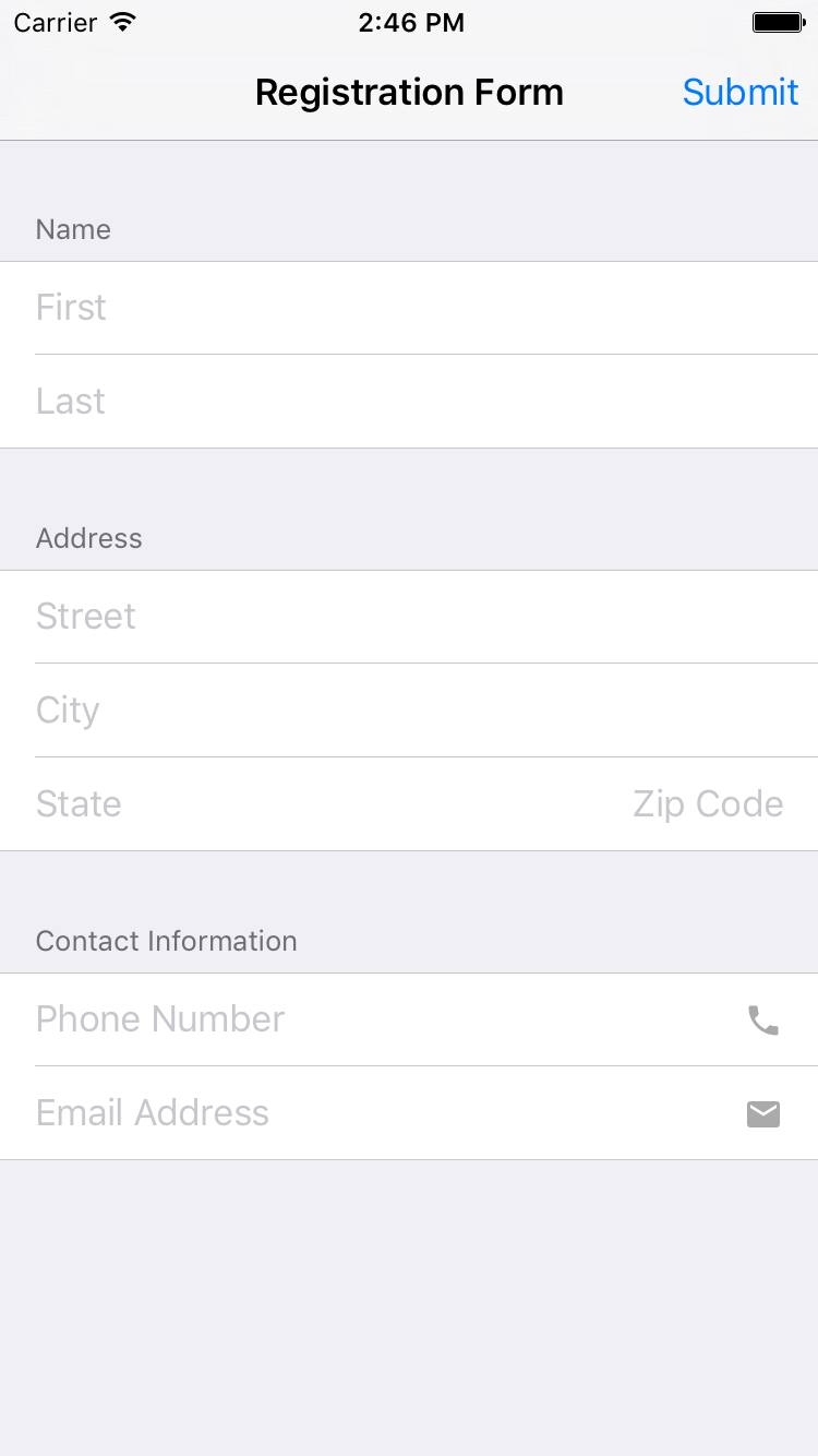
You will need to create image sets for the named images, “PhoneIcon” and “EmailIcon”. I used phone and email icons from Google’s material design collection when building the example application. Download the icon archives and unzip them somewhere on your local system:
Select the “Assets.xcassets” folder in Project Navigator and create two new image sets, one named “PhoneIcon” and the other named “EmailIcon”. Use the ic_phone_18pt.png image as the 1x phone icon asset, the ic_phone_18pt_2x.png image as the 2x phone icon asset, and the ic_phone_18pt_3x.png image as the 3x phone icon asset. Repeat this process for the email icons.
Finally, to ensure that the tint color we defined in the “hintIcon” template is correctly applied, we need to mark the image sets as “template images”. Ensure that the “Assets.xcassets” folder is still selected in Project Navigator, and reveal the Attributes Inspector by selecting View | Utilities | Show Attributes Inspector from the menu. Select the “PhoneIcon” image set and select “Template Image” from the “Render As” drop-down list. Repeat this process for the “EmailIcon” image set.
Now, when the icons are loaded, iOS will treat them as template images and will allow the tint color to be applied.
Other Attributes
The “autocapitalizationType” attribute is used in the preceding example to disable auto-capitalization for the email address field. Setting the value of this attribute to “none” is equivalent to programmatically setting the value of the text field’s autocapitalizationType property to UITextAutocapitalizationTypeNone, explicitly disabling auto-capitalization.
Additionally, setting the “rightViewMode” attribute to “always” is equivalent to setting the value of the field’s rightViewMode property to UITextFieldViewModeAlways, ensuring that the right view (i.e. the hint icon) is always visible.
Build and Run the Application
Build and run the application. The hint icons should appear to the right of the phone number and email address text fields with the light gray tint color specified by the template applied:
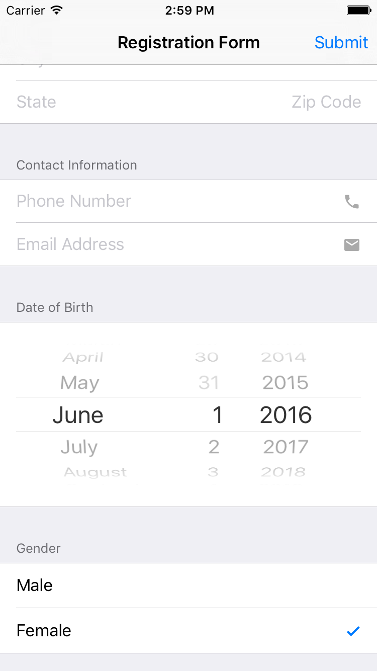
Date of Birth
Next, we will add a date picker to allow the user to provide a birth date. Add the following markup immediately after the email address cell declaration:
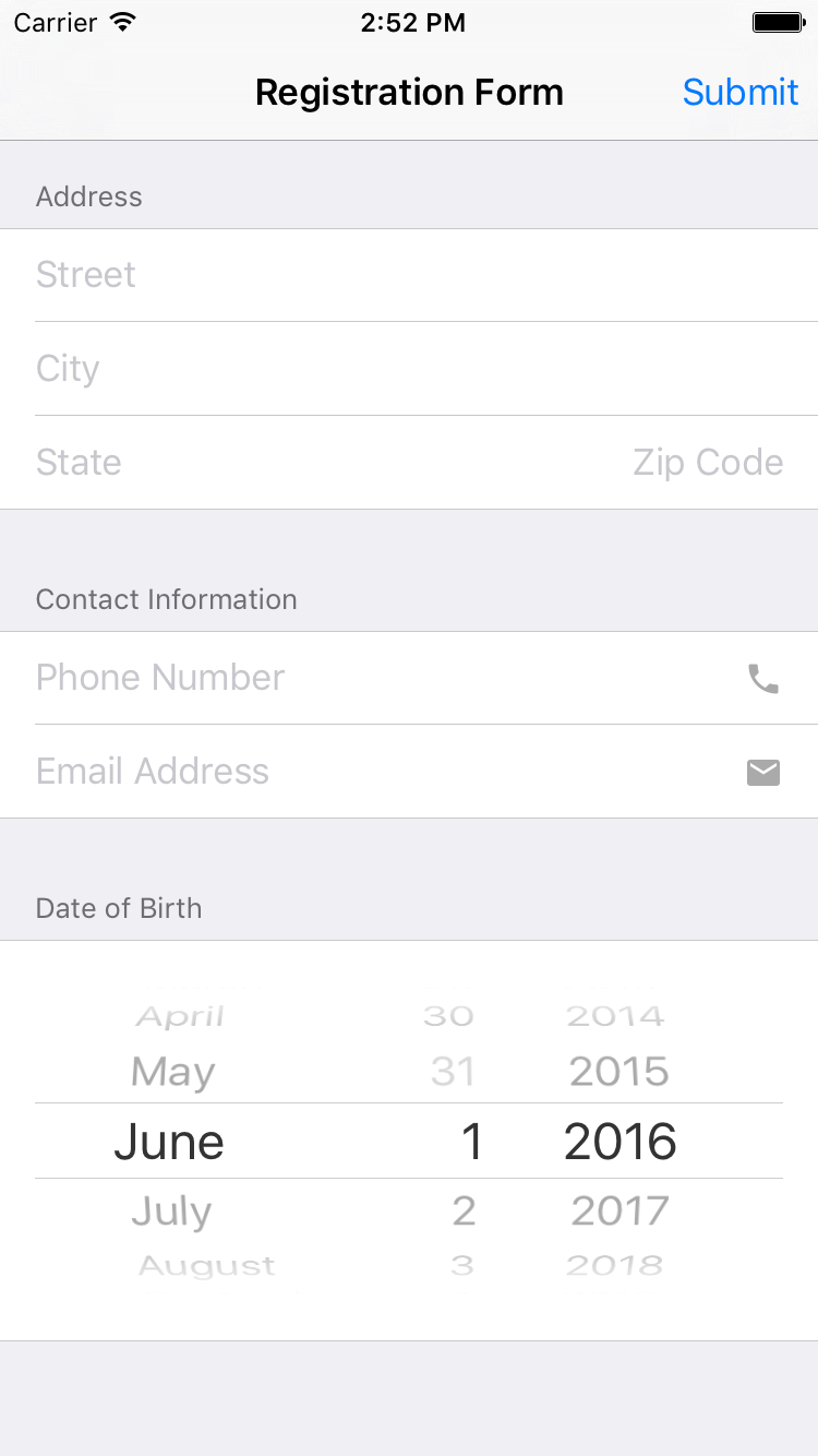
Note the use of the “height” attribute, which is used to constrain the height of the date picker to 162 pixels (the default height is larger).
Add the associated string value to Localizable.strings:
"dateOfBirth" = "Date of Birth";
Add the outlet to ViewController.swift:
@IBOutlet var dateOfBirthDatePicker: UIDatePicker!
That’s it! The form will now present an inline date picker allowing the user to select a birth date.
Build and Run the Application
Build and run the application. Scroll down to the bottom of the form. The birth date picker should look something like this:
Gender
Finally, we will create a table view section that allows the user to specify a gender. Add the following markup to ViewController.xml immediately after the date of birth cell:
The sectionName processing instruction corresponds to a call to the setName:forSection: method of LMTableView and is used to associate a text-based name with a section. Identifying sections by name rather than numeric index provides a level of indirection that allows sections to be added or reordered without breaking controller code.
The sectionSelectionMode processing instruction sets the selection mode for a section. It corresponds to a call to the setSelectionMode:forSection: method of LMTableView. Valid values for this PI include “default”, “singleCheckmark”, and “multipleCheckmarks”. The “default” option produces the default selection behavior (the application is responsible for managing selection state). The “singleCheckmark” option ensures that only a single row will be checked in the section at a given time, similar to a group of radio buttons. The “multipleCheckmarks” option causes the checked state of a row to be toggled each time the row is tapped, similar to a group of checkboxes. Since we only want to allow the user to select a single gender at a time, we’re using the “singleCheckmark” selection mode here.
Note that, unlike all of the previous sections, this section uses instances of UITableViewCell rather than LMTableViewCell to represent the gender options. While we could have used LMTableViewCell here as well, this isn’t necessary, since UITableViewCell already allows us to easily present read-only text content via its text label.
The value property is defined by an extension MarkupKit adds to the UITableViewCell class. It is used to associate an optional value with a cell, such as the “M” and “F” gender codes shown above. MarkupKit also adds a boolean checked property to UITableViewCell which, when set, causes a checkmark to appear in the corresponding row. We’ll use these values later when we complete the implementation of the submitForm method.
As with the previous sections, we need to add the localized values to Localizable.strings:
"gender" = "Gender";
"male" = "Male";
"female" = "Female";
However, unlike previous sections, this section does not define any outlets. Instead, we’ll add the following constant to the view controller class, immediately following the date picker outlet:
static let GenderSectionName = "gender"
We’ll use this constant to help retrieve the selected value from the gender section when the form is submitted.
Build and Run the Application
Build and run the application. Scroll down to the bottom of the form. The gender section should look something like the following. Tapping a row updates the selection state for the section:
Submit the Form
The final step in this tutorial is to write the code that simulates the form submission. Way back at the beginning, we stubbed out the code for the submitForm method that will handle this. We’ll now come back and complete the implementation of this method. We’ll leave the placeholder alert we created to provide feeback to the user and make it seem as though something is happening. However, we’ll add some new code to extract the values from the form fields and use them to create a JSON object we might submit to a hypothetical REST service to register the user.
Add the following code to the controller’s submitForm method, immediately before the code that displays the alert:
// Get selected state code
let state = (stateTextField.text!.isEmpty) ? "" : statePickerView.valueForRow(statePickerView.selectedRowInComponent(0), forComponent: 0)!

// Format date of birth
let dateFormatter = NSDateFormatter()

dateFormatter.dateStyle = .ShortStyle
dateFormatter.timeStyle = .NoStyle

let dateOfBirth = dateFormatter.stringFromDate(dateOfBirthDatePicker.date)

// Get selected gender
let genderSection = tableView.sectionWithName(ViewController.GenderSectionName)
let selectedGenderRow = tableView.rowForCheckedCellInSection(genderSection)

let gender = tableView.cellForRowAtIndexPath(NSIndexPath(forRow: selectedGenderRow, inSection: genderSection))!.value!
First, if the user has entered anything in the state field, we get the value of the selected row in the state picker. Next, we retrieve the selected date from the date picker and format it using the “short” date style and no time style. We then look up the index of the gender section using the GenderSectionName constant, use it to retrieve the index of the checked cell in the section, and then use both values to get the value associated with the selected cell.
Finally, we can write the code that will simulate the form submission. Add the following code to submitForm, immediately after the preceding code:
// Simulate form submission
let form = [
    "firstName": firstNameTextField.text!,
    "lastName": lastNameTextField.text!,
    "street": streetTextField.text!,
    "city": cityTextField.text!,
    "state": state,
    "zipCode": zipCodeTextField.text!,
    "phoneNumber": phoneNumberTextField.text!,
    "emailAddress": emailAddressTextField.text!,
    "dateOfBirth": dateOfBirth,
    "gender": gender
]

let data = try! NSJSONSerialization.dataWithJSONObject(form, options: NSJSONWritingOptions.PrettyPrinted)

print(String(data: data, encoding: NSUTF8StringEncoding)!)
This code creates a dictionary instance containing all of the form values we want to submit to the server. It then creates a JSON object from the dictionary and logs the dictionary contents to the console.
Build and Run the Application
Build and run the application. Enter some values in the form and tap the “Submit” button. You should see the placeholder alert we created earlier:
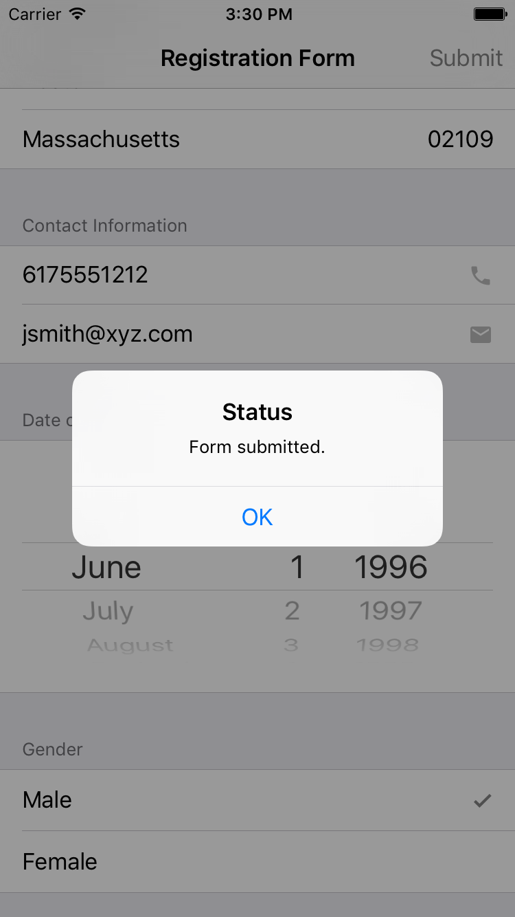
Additionally, you should see something like the following in the console, simulating the form submission to the server:
{
  "city" : "Boston",
  "gender" : "M",
  "street" : "123 Main St.",
  "lastName" : "Smith",
  "phoneNumber" : "6175551212",
  "dateOfBirth" : "6\/1\/96",
  "zipCode" : "02109",
  "firstName" : "John",
  "emailAddress" : "jsmith@xyz.com",
  "state" : "MA"
}
Where To Go From Here
As usual, you can download the final project here.
This tutorial introduced the MarkupKit framework by demonstrating how to build a simple registration form using markup. For more information, including additional examples, please visit the MarkupKit project on GitHub.
Discover more from SweetTutos
Subscribe to get the latest posts sent to your email.